Whether your trade show exhibit is a large island or a 20 x 20 trade show booth, every business wants to ensure they stand out from the crowd. At their core, many trade show exhibits are the same- system, double-decker, pavilion, fabric enhanced, or even hybrids. What isn’t the same is the draw that each trade show exhibit provides. Why do some booths stand out from the crowd whereas others fade into the background? The answer could lay in color theory.
The Importance of Color in Branding
Many marketers have espoused the idea that color evokes specific emotions in consumers. We’ve heard that yellow conveys warmth, red evokes excitement and green conveys a peaceful feeling. Yet, in many cases, our responses to color are largely based upon our own unique culture, heritage, bias, and color preferences. This is why marketers seek to identify the perfect colors in their branding- whether that is in an email campaign or a trade show exhibit. Often, they seek to find colors that will inspire action and create a lasting emotional connection with the brand in a predefined market.
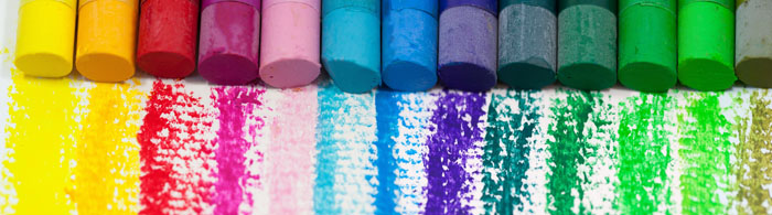
Designers seek to use complementary colors in spectrums defined as cool, warm, or neutral. In each of these spectrums, some colors will naturally go together and some will clash. If colors are too discordant, some color combinations may actually turn consumers off of your branding, whether displayed on your trade show exhibit or in your collateral.
Colors are defined as complementary when they are any two colors opposite each other on the color wheel, any three colors equally spaced around the color wheel, or any four colors that are actually two pairs opposite each other. This is important to keep in mind when designing your trade show exhibit to stand out using color theory.
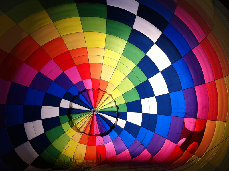
Color Psychology and Your Trade Show Exhibit
In a study entitled “The Impact of Color on Marketing,” researchers found that consumers made up to 90% of snap decisions about a brand based on color alone, including whether a color was appropriate or not for the brand. With this knowledge, color becomes central to discussions about the brand, including how to display the brand in a trade show exhibit.
With so many choices of color in your trade show exhibit, the key is to determine your brand personality. Not all brands are the same- some are rugged, some are daring and bold, and others are technical. You’ll want to feature colors in your trade show exhibit design that convey this personality to your desired audience.
There is no one way to use color in your trade show exhibit. Because it is largely dependent upon cultural and personal preferences and biases, the key is to know your demographic. If you are designing a trade show exhibit in China, you may want to consider the color red. The color red is a very lucky color in that culture. Knowing these subtle differences can help you decide which colors to incorporate into your trade show exhibit.
Trade Show Exhibit Trends for 2018
In 2018, we have so far seen hundreds of colorful displays. Increasingly, booths are opting for more inventive and imaginative colors. Polaroid recently unveiled its booth at CES that was a kaleidoscope of color. This conveyed a sense of fun and whimsy at their trade show exhibit. At Black Hat, many tech companies opted for colorful electric purples and pinks and blues.
This makes sense since Pantone has named PANTONE 18-3838 Ultra Violet as its color of the year in 2018. Pantone refers to it as “inventive and imaginative” and “dramatically provocative”. When it comes to designing a trade show exhibit, our team is always at the forefront of design updates. However, it may take exhibitors time to catch up from last year’s green revolution.
Ultimately, knowing the basics of color theory can help you to work with your trade show exhibit design house to create just the right brand emotion to draw more leads. This in turn can help your trade show exhibit to stand out from the crowd.