Trade show visitors are bombarded with hundreds of visual messages in just a few hours on the show floor. With only seconds to capture their attention, your trade show booth design must be intentional. One proven design principle that can help exhibitors stand out is the Rule of Thirds.

What Is the Rule of Thirds?
The Rule of Thirds is a design guideline that divides an image—or in this case, a booth—into nine equal sections using two horizontal and two vertical lines. Key design elements are placed along these lines or at their intersections. This creates balance and directs the viewer’s eye toward what matters most.
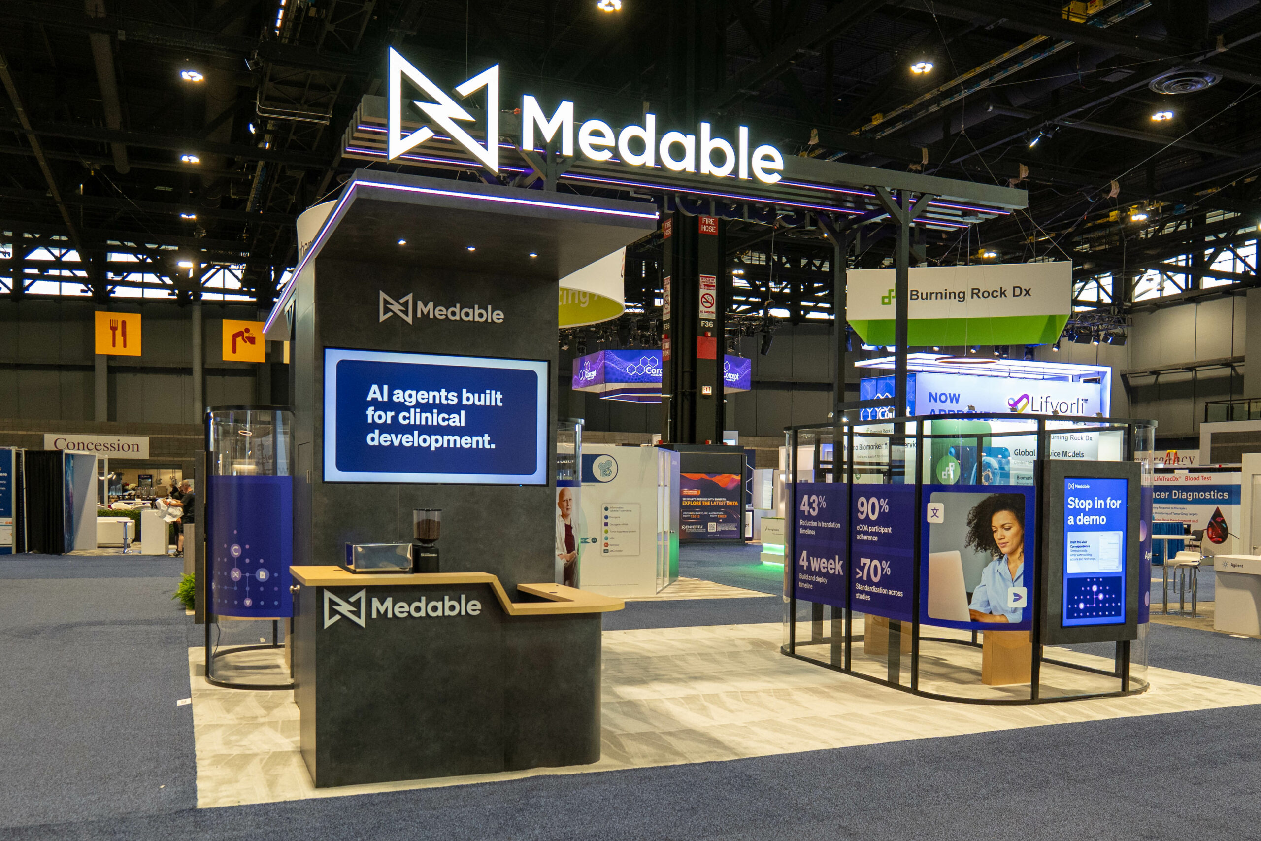
Applied to trade show booth design, the Rule of Thirds helps ensure your layout isn’t chaotic or visually overwhelming. Instead, it guides visitors naturally toward focal points like your signage, displays, or product demos.
Why the Rule of Thirds Works for Exhibits
Balance
Balanced design prevents one part of the booth from overpowering another. Symmetrical balance, where elements radiate evenly from the center, is often the most effective on the show floor. Using the Rule of Thirds, designers can place focal points evenly so the trade show booth design balance feels stable and inviting, rather than cluttered or lopsided.
Line of Sight
Directing a visitor’s gaze is critical. Your overhead signage, backlit counters, and product displays should work together as a visual path rather than competing for attention. By aligning major focal points along thirds, you create a natural line of sight that draws attendees deeper into the booth. Without this intentional flow, visitors may pass by without fully understanding your value proposition.
Harmony of Color
Color choices impact mood and perception. Poorly balanced hues can create visual tension that drives visitors away. Under the Rule of Thirds, color placement is as important as signage or props for your trade show booth design. Proportion warm and cool colors carefully, and align bold color accents with intersection points to heighten their impact. Harmonious color balance makes your booth more appealing and memorable.
Applying the Rule in Practice
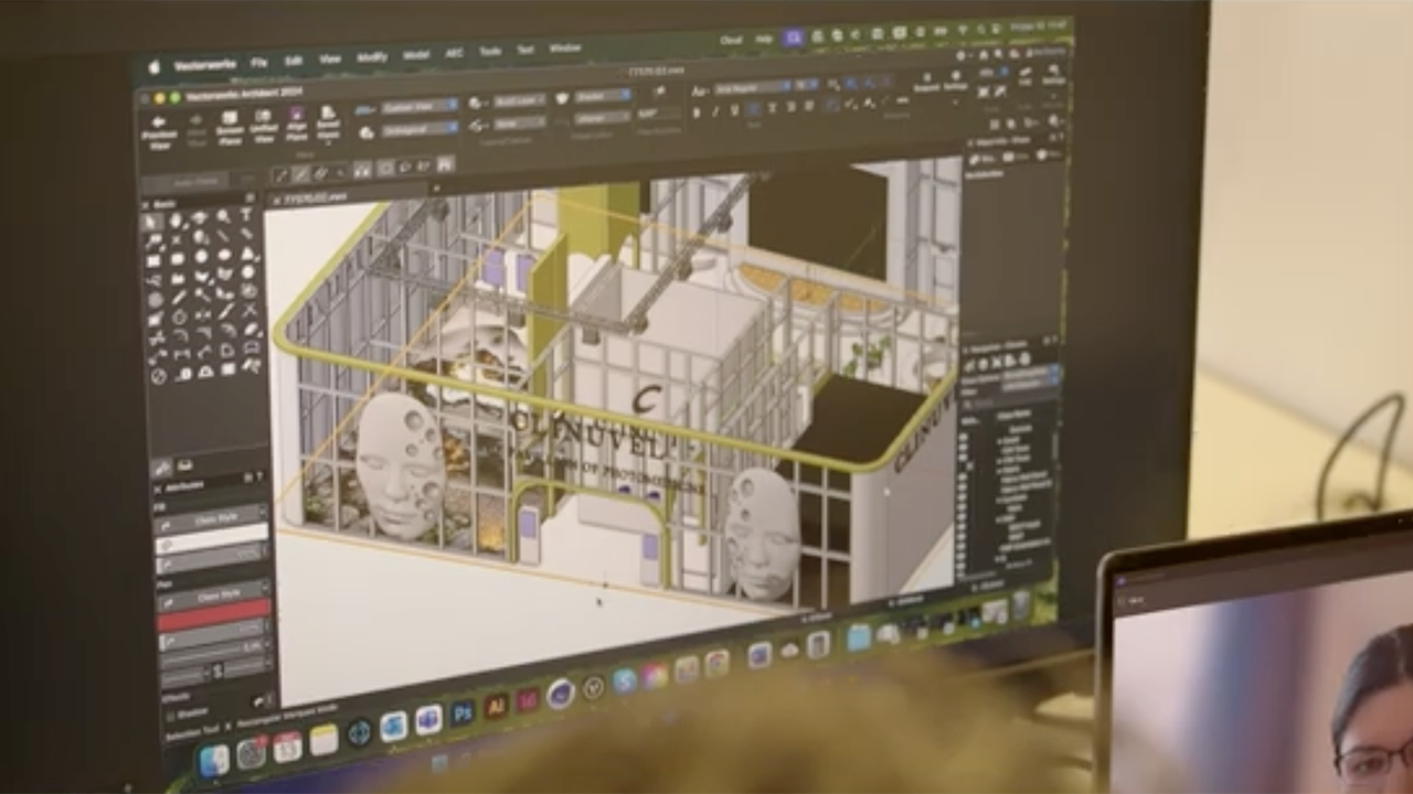
While experienced exhibit designers often incorporate these principles, exhibitors sometimes unintentionally disrupt the balance—by adding too many kiosks or placing products in conflicting areas. The best results come from collaborating with your designer, offering input while trusting their use of the Rule of Thirds to create a cohesive, high-impact booth.
Exhibitors who embrace these design fundamentals often find their booths draw more attention and feel more inviting. Companies that work with full-service partners such as Absolute Exhibits benefit from creative designs that apply these principles while aligning with brand goals.